


Draw diagrams for Cyber Threat Intelligence (CTI) analysis.
Installation
Import pivot from the preview namespace and the Typst compiler fetches it (and CeTZ) on first build. There’s no manual install step:
#import "@preview/pivot:0.3.0": packet, struct, hexdump
Using pivot
Currently, there are five diagrams. Three — packet, struct, and hexdump — are
byte-region views sharing one vocabulary: bytes(n), bits(n), gap(n),
reserved(n), with at: (offset) and fill: (highlight). You describe the entity
(widths and labels); pivot derives the offset, row, and ruler number. The other two
stand alone: timeline plots event(...)s on an ordered axis — horizontal, vertical,
or snaked — and flowchart draws node(...)s joined by edge(...)s, laid out
automatically top-to-bottom or left-to-right.
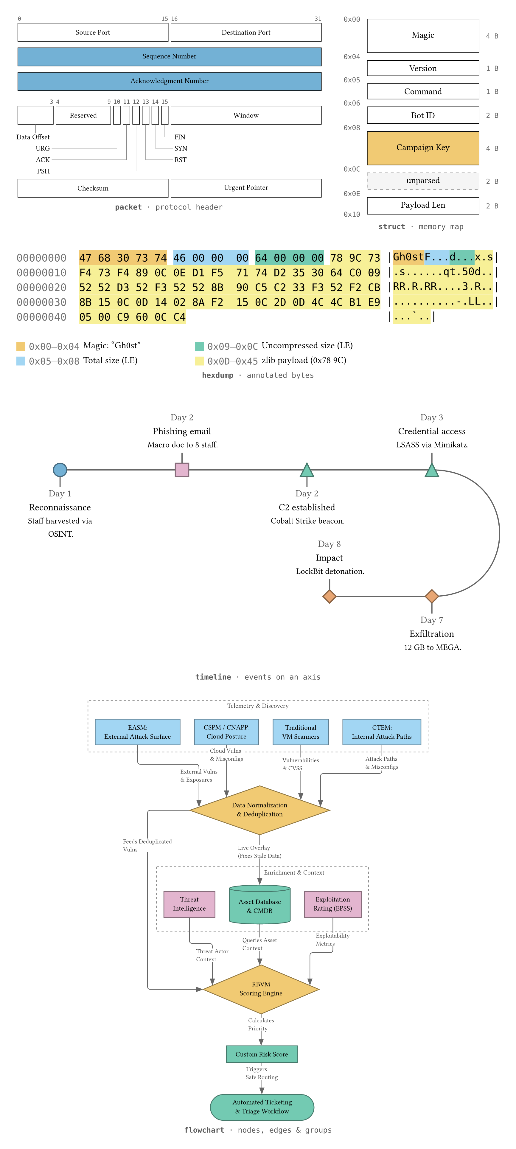
The gallery diagrams above are built from calls like these:
A packet — the TCP header, with the sequence and acknowledgment numbers
highlighted (the narrow flag bits become leader callouts automatically):
#import "@preview/pivot:0.3.0": packet, struct, hexdump, bytes, bits, gap, palette

#packet(
  bytes(2)[Source Port], bytes(2)[Destination Port],
  bytes(4, fill: palette.blue)[Sequence Number],
  bytes(4, fill: palette.blue)[Acknowledgment Number],
  bits(4)[Data Offset], bits(6)[Reserved],
  bits(1)[URG], bits(1)[ACK], bits(1)[PSH], bits(1)[RST], bits(1)[SYN], bits(1)[FIN],
  bytes(2)[Window],
  bytes(2)[Checksum], bytes(2)[Urgent Pointer],
)
struct — a malware C2 beacon header as a memory map:
#struct(
  bytes(4)[Magic],
  bytes(1)[Version], bytes(1)[Command], bytes(2)[Bot ID],
  bytes(4, fill: palette.orange)[Campaign Key],
  gap(16)[unparsed], bytes(2)[Payload Len],
)
hexdump — a Gh0st RAT C2 check-in, fields annotated in the captured bytes:
#hexdump(
  data: read("ghost-checkin.bin", encoding: none),
  bytes(5, at: 0x00, fill: palette.orange)[Magic: "Gh0st"],
  bytes(4, at: 0x05, fill: palette.sky)[Total size (LE)],
  bytes(4, at: 0x09, fill: palette.green)[Uncompressed size (LE)],
  bytes(57, at: 0x0d, fill: palette.yellow)[zlib payload (0x78 9C)],
)
A timeline — a ransomware intrusion on a snaked axis. In this example shape and colour mark
a simplified attack-lifecycle, so each reads as a block of matching markers improving comprehension.
Colour customisable but unfilled by default:
#import "@preview/pivot:0.3.0": timeline, event, palette

#timeline(
  orientation: "snaked",
  wrap: 4,
  event(time: "Day 1", fill: palette.blue, description: [Staff harvested via OSINT.])[Reconnaissance],
  event(time: "Day 2", shape: "square", fill: palette.purple, description: [Macro doc to 8 staff.])[Phishing email],
  event(time: "Day 2", shape: "triangle", fill: palette.green, description: [Cobalt Strike beacon.])[C2 established],
  event(time: "Day 3", shape: "triangle", fill: palette.green, description: [LSASS via Mimikatz.])[Credential access],
  event(time: "Day 7", shape: "diamond", fill: palette.vermillion, description: [12 GB to MEGA.])[Exfiltration],
  event(time: "Day 8", shape: "diamond", fill: palette.vermillion, description: [LockBit detonation.])[Impact],
)
A flowchart — a risk-based vulnerability-management pipeline visualised. Titled
group(...) boxes mark the discovery and enrichment stages, node shape marks the
role (diamonds decide, the cylinder is a datastore), and colour marks the function.
Pivot decided the layout, the user described the shape of the data:
#import "@preview/pivot:0.3.0": flowchart, node, edge, group, palette

#flowchart(
  node("easm", [EASM: \ External Attack Surface], fill: palette.sky),
  node("cspm", [CSPM / CNAPP: \ Cloud Posture], fill: palette.sky),
  node("vmscan", [Traditional \ VM Scanners], fill: palette.sky),
  node("ctem", [CTEM: \ Internal Attack Paths], fill: palette.sky),
  node("norm", [Data Normalization \ & Deduplication], shape: "diamond", fill: palette.orange),
  node("ti", [Threat \ Intelligence], fill: palette.purple),
  node("epss", [Exploitation \ Rating (EPSS)], fill: palette.purple),
  node("cmdb", [Asset Database \ & CMDB], shape: "cylinder", fill: palette.green),
  node("rbvm", [RBVM \ Scoring Engine], shape: "diamond", fill: palette.orange),
  node("score", [Custom Risk Score], fill: palette.green),
  node("ticket", [Automated Ticketing \ & Triage Workflow], shape: "rounded", fill: palette.green),
  edge("easm", "norm", label: [External Vulns \ & Exposures]),
  edge("cspm", "norm", label: [Cloud Vulns \ & Misconfigs]),
  edge("vmscan", "norm", label: [Vulnerabilities \ & CVSS]),
  edge("ctem", "norm", label: [Attack Paths \ & Misconfigs]),
  edge("norm", "cmdb", label: [Live Overlay \ (Fixes Stale Data)]),
  edge("norm", "rbvm", label: [Feeds Deduplicated \ Vulns]),
  edge("ti", "rbvm", label: [Threat Actor \ Context]),
  edge("epss", "rbvm", label: [Exploitability \ Metrics]),
  edge("cmdb", "rbvm", label: [Queries Asset \ Context]),
  edge("rbvm", "score", label: [Calculates \ Priority]),
  edge("score", "ticket", label: [Triggers \ Safe Routing]),
  group("telemetry", [Telemetry & Discovery], "easm", "cspm", "vmscan", "ctem"),
  group("enrich", [Enrichment & Context], "ti", "epss", "cmdb"),
)
Automatic layout, with a nudge when you want one
The point of flowchart is that pivot does the layout: you write nodes and
edges — never coordinates — and it ranks, aligns, spaces, and routes them for
you. On a dense diagram the automatic placement can occasionally drop a label
somewhere tight. When it does, move that one label with label-offset and
pivot keeps doing everything else:
// page units — +y is up, +x is right, the same in either orientation
edge("rbvm", "score", label: [Calculates \ Priority], label-offset: (0pt, 6pt))
Only that label shifts; every node, edge, and other label stays exactly where
pivot placed it — and the label still reserves its new spot, so nothing else
lands on top of it. It’s a finishing touch, not a layout tool: for a whole
crowded region, give the diagram more room with flowchart-lane-gap instead
and let pivot re-solve the lot.
Diagrams
Available Diagrams
packet |
Flat protocol-header view — fields wrap into rows under a bit ruler; narrow labels become leader callouts. |
struct |
Vertical memory map — box height tracks byte size, hex offsets down the side, sub-byte fields expand in place. |
hexdump |
Real bytes with an ASCII gutter, fields highlighted in place and keyed in a colour legend. |
timeline |
Events on an ordered axis — horizontal, vertical, or a snaked layout that wraps long runs into curved rows. A marker’s shape and colour can be customised. |
flowchart |
Nodes joined by directed edges, auto-laid-out top-to-bottom or left-to-right. Shape can denote a node’s role (rounded / rectangle / diamond / parallelogram). |
The first three share one field vocabulary (bytes / bits / gap / reserved)
over the same model, so views of the same bytes can’t disagree. timeline and
flowchart are their own families, built from event(...)s and
node(...) / edge(...)s.
Diagram Roadmap
Alphabetical order, i.e., not the order in which they will be released.
| ATT&CK matrix | Technique coverage as a grid. |
| Attack tree | A hierarchical representation of paths an adversary could take to achieve a goal. |
| Bowtie | A event at the center, threats on the left, consequences on the right, annotated with preventive and mitigating barriers. |
| Diamond Model | The four vertices: adversary, capability, infrastructure, victim. |
| Knowledge graph | Typed entities as nodes joined by labelled edges. |
| Pyramid of Pain | Indicator types ranked by adversary cost. |
| Sequence | A time-ordered view of interactions between parties. |
Accessibility
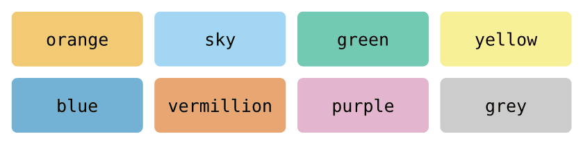
Readability is the default. Pivot exposes palette.[colour] allowing you to use the 8-colour Okabe–Ito colour-blind-safe
palette:
The rest of the defaults stay legible and adjustable:
- Inherits the document font. Field labels use your document’s font. The bit ruler and hexdump grid pin to the bundled monospace (DejaVu Sans Mono) to keep columns aligned.
- Sizes are theme tokens.
label-size,bit-size, andhexdump-sizescale up for legibility, e.g.theme: themes.default + (label-size: 12pt).
Documentation
Full docs are in progress. For now,
examples/ has a
runnable example for every diagram.
Adding a caption to a diagram
Captions come from Typst’s own figure function. The default caption gap is a little tight,
a slightly wider #set figure(gap: 1em) reads better:
#set figure(gap: 1em) // a little more room than the 0.65em default

#figure(
  packet(
    bytes(2)[Source Port], bytes(2)[Destination Port],
    bytes(4)[Sequence Number],
  ),
  caption: [TCP header (excerpt)],
)
Built on CeTZ
pivot renders with CeTZ, licensed under LGPL-3.0-or-later. CeTZ is fetched independently at build time.
License
Apache-2.0. See NOTICE for attribution.